| The
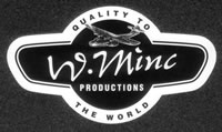
W. Minc logo was conceived in 1994 -
Dave Walsh and Steve Miller had, in a fit of idealism, decided
to release records on their own label, W. Minc Productions. They
needed a logo and enlisted the help of Toby and Steven at Artifishal
Studios to put their shonky sketches into some kind of glossy
corporate order. They had decided on the Catalina as a worthy
symbol of rarity and quality in the face of adversity. They'd
heard there was only one still flying and it seemed fitting somehow.
They were still tossing around mottos and were leaning towards
W. Minc Against The World.
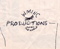
At some stage a suspicion sneaked in
that the motto may be a tad on the dramatic side and Quality
For The World began to appear in their scribbles, albeit way
off to the side.
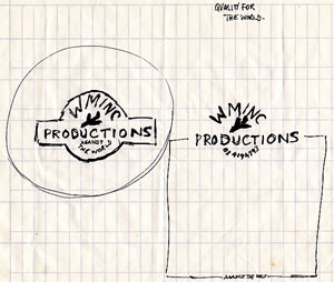
The quality motto took the upper hand
and a more streamlined, winged container was sketched for the logo.
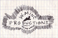
Toby and Steven (mostly Steven I think)
took this last sketch and turned it into this nicely corporate
creation.
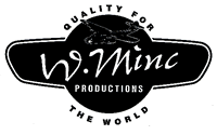
Nearly there - it was finally decided
that Quality To The World had a better ring to it and
the logo was ready for placement on the very first release, Mark
C Halstead's
Before And After Love.
But that's not the end of the story.
....more››
|